Friday, 7 October 2016
Starter Task
Proposal: A formal document where you outline your ideas and what you plan to do for the use of those who you are producing the product for.
Proposal (P) >>> Distribution and marketing (M)
Sample Material (P)
Proposal (P) >>> Distribution and marketing (M)
Sample Material (P)
Friday, 30 September 2016


Friday, 23 September 2016


Friday, 16 September 2016
Starter task: Conventions of a magazine
Banner - A block of colour that can have sell lines in etc.
Sell line - Information onthe front cover to sell the magazine.
House style - Colour scheme, graphics "brand"
Anchorage -
Sell line - Information onthe front cover to sell the magazine.
House style - Colour scheme, graphics "brand"
Anchorage -
Tuesday, 13 September 2016
LO1 Houstyle Ideas: Masthead

Due to the name "Seven Peaks" i plan to use vectorised style images which represent the peaks/ mountaneous elements of the name. In addition to this i plan to use a solid block colours of green. However, i also plan to experiment with gradients to create more visual intresent. The use of a bold sans serif font will be used and possibly overlayed ontop of the icongoraphy as it allows for the reader to clearly identify the magazine.
Monday, 12 September 2016
L01: task 2 Sample materials (Masthead designs)
Main font: Primetime Regular


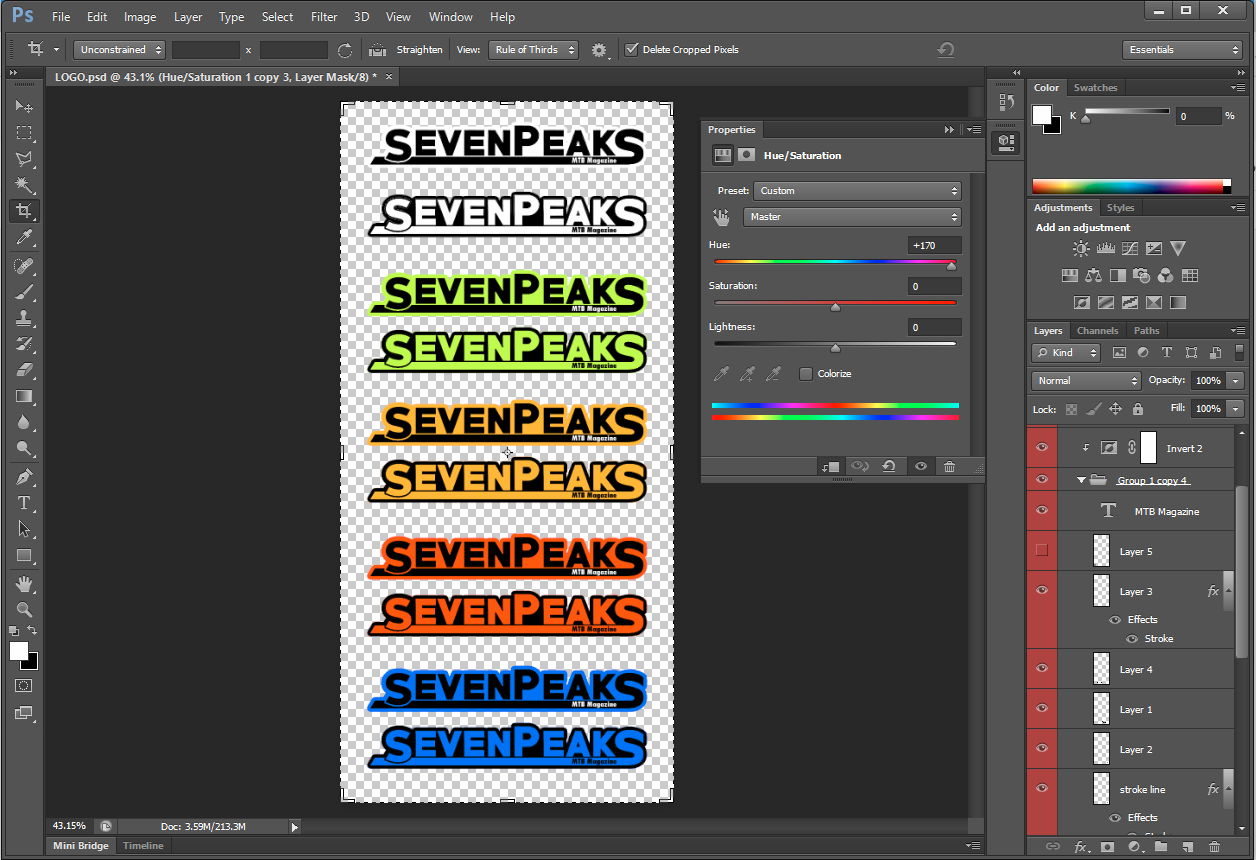
Due to the initial designs being more suitable for use as a logo i then re designed this to for use as a masthead. To do so i used the same font style (Primetime) in addition to applying various strokes and shading. The 'S' was also manipulated to incorporate a solid line which underlines the text and provides a clear divide. The 'S' was also used as it is seen to represent a mountain bike trails, this could further be enhanced by adding relevant vectors such as trees, tyre treads or possibly a grunge/ mud effect. Additionally, i may further edit the masthead to incorporate key icongnography relating to the genre of the magazine. For example i may manipulate the 'A' to represent the mountainous aspects of the sport in addition to adding a gradient apposed to block colours to create more visual interest.
Sunday, 11 September 2016

Saturday, 10 September 2016


Friday, 9 September 2016
LO1: Proposal
Magazine Proposal
Purpose
The purpose of my magazine is to inform, educate and entertain the reader. Most noticeably this magazine will be aim to inform and educate this is because I plan to include informative aspects such as product reviews and educational segments in the main articles and double page spreads.
Form and Genre
The genre of my magazine will be sports. I plan to specifically design and produce this magazine specifically on the sport of mountain biking. Furthermore, I plan to make this magazine regional based as it will include elements from the surrounding areas such as trail locations and maps throughout the piece. Despite this It does not restrict the media being published nationally as it will still appeal to large majority of the intended audience.
Content
As part of this I have been asked to produce six pages, both a front cover and contents page as well as two double page spreads to appeal to a Sheffield based audience.
Front Cover – For the cover page I plan to use a bold sans serif font with grunge style overlay in addition to a graphic such as a wheel or bike related imagery as this style would clearly portray the nature of the sport and therefore the magazine whilst also having clear connotations of action and excitement which I plan to emulate throughout. The main masthead will read ‘Seven Peaks MTB’ as this name relates to the regional aspect of the magazine whilst also directly referring to the sport and therefore the context of the magazine. The sans serif font will also allow the audience to easily read and interoperate the text. Sell lines I plan to use; “top tips for new riders”, “Fix it yourself” and “Tyred argument” most importantly this sell line would also be affective as the pun creates interest and also directly refers to the content of the article. As a whole I plan to use bold and vibrant block colours in the house style as these have a greater impact as they significantly contrast the background and stand out clearly against most imagery. Examples of colours I plan to use are yellows/ oranges, magentas and possibly whites in some places. Most noticeably oranges would be used as it connotes and is perceived to be creative, energetic, expressive, dynamic and is also often seen in recruitment, entertainment, education and sport medias.
Similarly, I also plan to use a candid/ action style image which dominantly features a mountain biker which again clearly shows the reader the nature of the magazine whilst also immediately engaging them. The picture should also show the rider in a positive light to engage the audience and to allow the model to be perceived as the ideal self or partner. For this I plan to use a fisheye lens and be positioned close up to the action with a slower shutter speed to create a slight motion blur to connote the fast paced aspect of the sport. Alternatively, a high shutter speed could be used to create a crisp sharp image that is seen to freeze the motion however, a flash gun may also be required for this to highlight the rider. The fisheye lens would also be suitable as it provides an extreme wide angle view and therefore could encapsulate all the action in its entirety. Alternatively, a 50mm f/1.8 portraiture lens could be used as this would emphasize the rider/ action due to the shallow depth of field created by the lower f stop. The composition for this photo would also be key as it has to be visually appealing whilst also being functional as a front cover. For example, I plan to use the rule of thirds to create an image that is more appealing to the eye although I also would have to take into account where the text elements such as the sell lines and banners would be placed so that they do not interfere with the imagery.
Contents Page – I plan for the contents page of this magazine to be dominantly filled with imagery and references to pages as this is a common theme throughout the genre of this magazine additionally I feel that it would be more visually appealing. Examples of images I plan to include is the action style images featured in the main articles and double page spreads, all of which will have vibrant colours to add visual interest and add emphasis to the piece. In addition to this, there will be a section clearly defined, which describes the contents and pages that will involve articles on; product reviews/showcase, rider stories, news and updates, maps/locations and prizes or giveaways. Possible giveaways could include products such as tools, this would be well suited to the magazine as it acts as an incentive for readers to buy the magazine and also allows for sponsors to fund this as a result of getting recognition for their brand/ product. Furthermore, competitor magazines such ‘MBUK’ similarly include a mountain bike related product with every monthly issue included in the price of the magazine. Throughout this page the house style will be consistent to stay in line with the appearance of the entirety of the magazine.
Double page spreads -
The main double page spread for the magazine will feature an article on the personal stories and experiences of riders. Therefore, the article would contain personal interviews with riders and their stories. In addition to this, I plan to incorporate other aspects such as information and events all of which relate to the personal stories of the rider. For the interview I plan to use several qualitative questions put forward to key sporting individuals such as Steve Pete, this would be well suited because Steve Pete is a renowned in the sport and has several first places in both national and world championships. Furthermore, this specific sportsman is local and lives in Sheffield, as a result this would have a greater appeal to the targeted local audience.
Another double page spread within the magazine would feature products being showcased and reviewed. Subsequently, this page will heavily feature close up photography of the products in question. For this I plan to use a portrait lens to achieve a shallow depth of field to emphasize the product on show. Similarly, the photos will also be taken in a natural setting to reiterate the ideas of the natural setting in which the sport is often undertaken in. With regards to the body copy, it is likely that this page will be less text oriented with frequent use of facts and statistics such as pricings and a possible star rating incorporated into the design to represent the reviewing aspect of the page.
Throughout all the text and pages of the magazine I plan to keep a consistent house style and mode of address as this is seen in many current magazines. With regards to colour schemes and housetyle I plan to use the same bold, block colours proposed to be on the front cover of the magazine to keep in line with the idea of a consistent brand image. Furthermore, I also plan to use a limited amount of colours with the intention not to overcomplicate the page similarly on the main journalistic article (Interview DPS) I plan to use a limited number of images to support the article with the intention to draw attention to the main subject and the body copy featured. This article may also follow a more formal tone compared to the showcase page due to the structure and interview aspects of the piece. On the contrary, the review section is likely to feature a more peer to peer tone of address due to advice being given directly to the reader and the feature of reviews from real personnel within the sport.
Possible photo ideas (To be featured throughout the magazine):
- Large long scenic shot featuring MTB elements as it provides blank space where the body copy can be placed whilst still relating to the genre of the magazine. For this shot I plan to use a wide angled lens in conjunction with a tripod to create a clear and sharp landscape photo. A possible location for this would be the Peak District as this features many mountain bike trials and is also very scenic. This would also have a greater appeal to the Sheffield based audience of this magazine as this location is local to the target audience.
- Long exposure/ night photography – An image of a rider silhouetted by light or alternatively highlighted with light in the foreground whilst the majority of the background is in darkness would be effective as the dark colours would help highlight the text and make it stand out if lighters colours such as white are used.
- Slow shutter/ motion blur – An image where the rider is in focus in the foreground and the surroundings in the background are blurred would be effective as it adds emphasis the subject whilst providing a god backdrop for the text of the article.
- POV Shot – An image portraying the fast action nature of the sport. For this an action camera such as a GoPro would be required which could then be mounted on the bike frame or rider itself to provide a unique viewing angle and photo opportunity.
- Fish Eye action shot – For this shot a fish eye lens would be used as it provides an extreme wide angle view and therefore could encapsulate all the action in its entirety.
- All photos to be shot in RAW format to allow for greater control when editing the images.
Target Audience
The target audience for my magazine will likely be a younger demographic of around 15-35 years as this age range is more active with regards to this type of sport and lifestyle. The magazine will also be more likely to appeal to a more male orientated audience as again this sport is predominantly seen as a male oriented activity however this magazine will also cater for the female demographic also. In addition to these specification points the consumer of this product will also be a national uk audience or more specifically a regional audience due to the regional content I plan to feature in the magazine. With regards to spending power and disposable income, the target audience of this product will likely be that of a B, C1, C2 social grade meaning that they could afford a slightly more premium magazine at a slightly higher price to the mainstream magazines.

Imaginary Entity
Lucas Turner is an 18 year old university student with a passion for sport and healthy living. When not studying Lucas is often outdoors in some form and seeks for thrills in his fast paced, chaotic life, as a result he can often be founding hitting the downhill tracks and courses to get his adrenaline fix and escape bustling city life. Consequently, he often purchases his apparel from renowned sporting company's such as Nike and Adidas and is tech savvy with him frequently using various social media platforms to keep updated with the world and publish his ideas and lifestyle across a variety of devices and technologies. Most importantly, in the summer Lucas has plans to visit and partake in events across the country from road racing to competitive downhill tracks in addition to attending various music festivals as he loves the social aspect of such events.
Resources and Personnel
For this magazine I will be both the editor, photographer and graphic designer for all elements. However, for the articles and cover page, images are required and therefore I would also require a model; preferably of a younger age to appeal to the younger demographic seen in the target audience.
The hardware that I would require for this magazine and accompanying shoots would include a DSLR, tripod, various lenses such as a telephoto, portrait and wide angle or possibly fish eye lens would be needed, flashgun, graphics tablet and a computer with the necessary software.
Software which I would require is various programs included in the Adobe Creative Suite. Most importantly, Adobe InDesign will be needed to design the layout and design the appearance of the magazine. This software will also be used in conjunction with Adobe Illustrator to design the graphics and vectors, Adobe Photoshop to edit and manipulate the images/ graphics used. In addition to this I may also use Adobe Lightroom to edit the RAW images taken from the photoshoots.
 Distribution and Marketing Methods
When looking at other competitor magazines of a similar genre it is evident that the large majority operate on a subscription basis with delivery direct to the customer’s house. A subscription would be beneficial as it provides customers with the reassurance that they will never miss an issue and always have the latest issue as soon as possible in addition to the subscription being easily managed online with little hassle. The online subscription also allows for easier marketing. This is because the subscription will gain the email and addresses of those involved meaning that they can be directly targeted with marketing methods such as flyers or possibly news letters to engage with the audience and ensure they keep their subscription. This method would also be suitable to this genre as those who by this style of magazine often have a busy lifestyle and possibly don’t have the time to go out and purchase a magazine therefore this method may seem for favourable.
Another method which would prove successful in the distribution and marketing of the magazine would be of the distribution and consumption of the product via digital methods. For example, the magazine could be produced as a digital copy. Consequently, this would mean that it is easier to distribute to a larger audience whilst also being considerably cheaper as there is no need to pay for print and distribution services/ delivery. Another benefit of this would be that due to the magazine being produced in a digital format it would be easier to produce and distribute the content in other languages therefore increasing the potential audience and increasing the possible reach .This method would also be suitable as the target audience for this magazine are stated to be digital natives with a greater interest in technology and devices, therefore the ability for them to consume the product via there devices would be favourable. The E-Publishing of this magazine could be achieved in several different ways/ formats. For example the magazine could be distributed via an online website or alternatively other formats such as .app, .mobi or ePub which all allow for the product to be downloaded and viewed on devices such as eReaders and mobile/tablet devices. Furthermore, a mobile app could be produced to distribute the magazine. This would be beneficial as it would also allow for the brand to be established as it could include features allowing for interaction with the audience and cross promotion of the whilst also revenue being generated from digital advertising within the app via pop ups and banners.
To market the product below the line methods would be used to target the specific target audience. Most commonly, social media would be used as this is a free form of marketing and can be used to directly target a specific demographic with graphics, videos and links to where further information could be found. Furthermore, social media would be well suited to this product as the main target audience for this magazine is described to be digital natives with frequent interaction/ use of social medias and therfore online marketing would be the most effective method. Alternatively, above the line methods such as a radio advert or print posters could be used, although this does not reach a specific demographic it does however reach a mass audience and possible new consumers for the magazine.
In addition to this, I plan for copies of this magazine to be available in public places such as bars and cafes, stations and most importantly sporting shops such as JD Sports, Evans Cycles, Giant, Waller BMX as this is where it would have the greatest appeal due to the type of person who interact there. Consequently, I plan for the circulation of this magazine to be a possible total of 1,000 copies with a readership of 5,000 and a monthly distribution. This frequency would be best suited for this genre of magazine as it allows for each issue to have more interesting and relevant news due to the longer spacing.
Specification
Print Specifications
Double Page Spread
Safe Area: 350mm x 248mm
Trim:353mm x 251mm
Bleed: 356mm x 254mm
Full Page Safe Area: 175mm x 248mm
Trim: 178mm x 251mm
Bleed: 181mm x 254mm
Advertising Opportunities
Type of Adverts – Within the magazine adverts featured are likely to include sporting brands, products and shops such as Evans Cycles, Hope Tech and Polaris in addition to advertisements for upcoming events which would appeal to the target audience of the magazine.
Double page spread: £300
Full Page: £160
Half Page: £80
Quarter Page: £40
Eighth Page: £20
First DPS: £500
Back Cover: £500
Inside Front Cover: £400
Inside Back Cover: £400
Discounts;
12 issues – 35%
6 issues – 25%
3 issues – 15%
Subscribe to:
Comments (Atom)