Main font: Primetime Regular


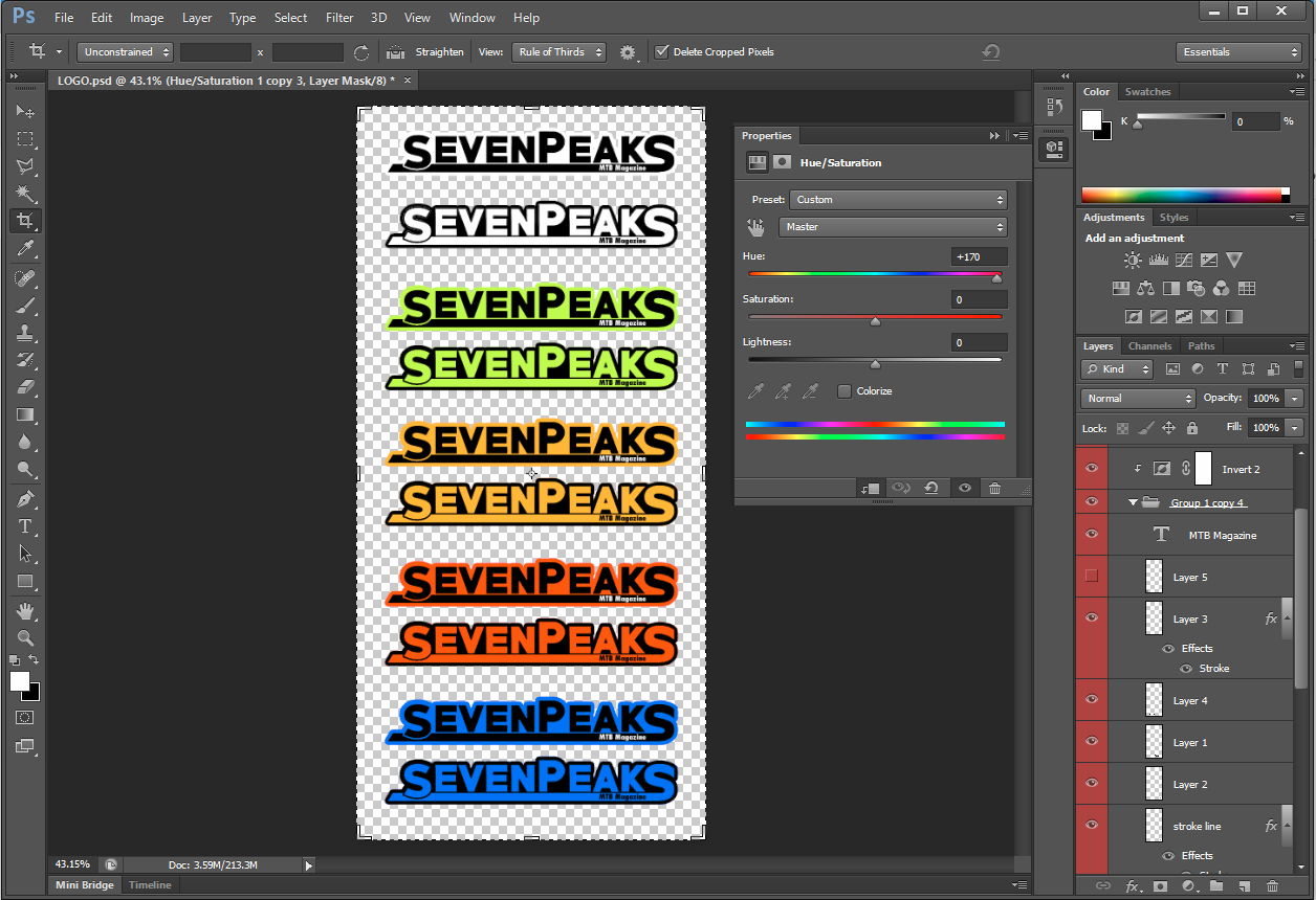
Due to the initial designs being more suitable for use as a logo i then re designed this to for use as a masthead. To do so i used the same font style (Primetime) in addition to applying various strokes and shading. The 'S' was also manipulated to incorporate a solid line which underlines the text and provides a clear divide. The 'S' was also used as it is seen to represent a mountain bike trails, this could further be enhanced by adding relevant vectors such as trees, tyre treads or possibly a grunge/ mud effect. Additionally, i may further edit the masthead to incorporate key icongnography relating to the genre of the magazine. For example i may manipulate the 'A' to represent the mountainous aspects of the sport in addition to adding a gradient apposed to block colours to create more visual interest.
No comments:
Post a Comment