Design and development of the main masthead to be used on the contents and cover page
Cover Page:
Masthead added and cover lines added. Originally they did no stand out against the background therefore a box was added to each of the line to contrast.
Map corner graphic was created in addition to adjusting colours of the cover lines to make the page more aesthetically pleasing, the text was also skewed as this is a common trait seen in similar magazines of this genre,
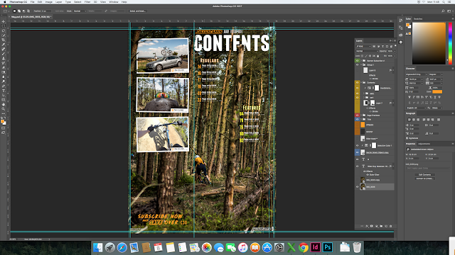
 First draft of the contents page done in Adobe Photoshop to set out layout. Certain graphics were then masked to give the effect they was in the scenery. EG. The "Contents" text hidden by the trees in addition to some of the images seen on the left. This was then exported as a jpeg into Adobe InDesign.
The design and layout of the text elements in InDesign.
Further developed design allows for better spacing and layout of contents on the page.
DPS Production:
Creating placeholders for text and images.
Creating Frames for images
Adding text and images to placeholders and formatting the texts size, font, form and angle. Also the main masthead was skewed to keep in line with the same style seen in the cover page.


No comments:
Post a Comment